Brand guide


For Media Outlets and Partners
Welcome to our partners’ guidelines and assets hub. We want to make it easy for you to interact with the VerseOne Distribution Brand while respecting our brand and legal/licensing restrictions. These guidelines have been developed to ensure that all VerseOne Distribution users receive the same brand identity – no matter which media platform they find us. Please be aware that by using these assets, you agree to our terms of service and privacy policy.
Welcome to our partners’ guidelines and assets hub. We want to make it easy for you to interact with the VerseOne Distribution Brand while respecting our brand and legal/licensing restrictions.
What you need to know
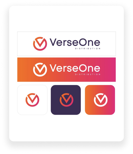
- To comply with our licensing agreements, you must always attribute
content from VerseOne Distribution with the logo. In partner
integrations, press releases and media publications, you should
always use our full logo (icon + wordmark). We do allow using only
our icon if it’s featured as an app icon on the app screen of a
device, or other icons. - The logo is the combination of a wordmark with our icon.
- Our icon is a shorter version of our logo. Only use it if you do
not have enough room for the full logo. - When you place our logo in a design, please make sure you give it
room to breathe; we call this “clear space.” Always leave a clear
space area equal to the cap height of the Pearson logotype
“LOGO.”Logo artwork comes with the clear space dimensions included
in the art board size.
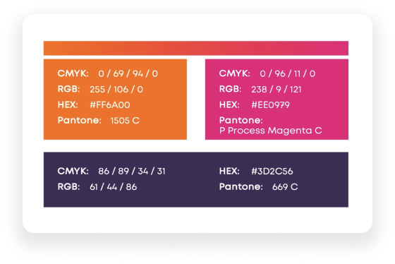
Colorful things to note
- While embracing a much more artsy and vibrant color scheme, we are careful to use colors that appeal to a youthful and playful mind.
- Following are the color usage on fonts. i.e. Headers Sub-header
and body text. - Headers, Sub-Headers & Body
- Text The black color should be used on light colored backgrounds.
The white color should be used on dark colored backgrounds. - Secondary Color Usage Secondary colors must be used where primary colors are not representing best.
- No other secondary colors used anywhere to represent the brand.
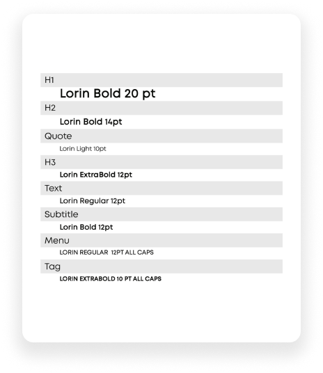
Our Type of Text
Typography is the art and technique of arranging type to make written language legible, readable and appealing when displayed. The term typography is also applied to the style, arrangement, and appearance of the letters, numbers, and symbols created by the process.
If you can’t our recommended font for your work, try commonly available default fonts in this order:
- Default sans-serif for the platform
- Helvetica Neue
- Helvetica
- Arial
About Our Icons
FAVICON
A favicon is a small, 16×16 pixel icon used on web browsers to represent a website or a web page.
Short for ‘favorite icon’, favicons are most commonly displayed on tabs at the top of a web browser, but they are also found on your browser’s bookmark bar, history, and more.
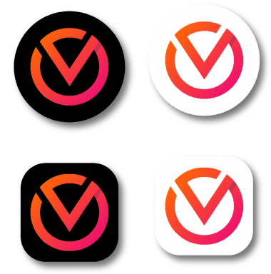
APPICON
An app icon is a visual anchor for your product. You can think of it as a tiny piece of branding that not only needs to look attractive and stand out, but ideally also communicate the core essence of your application. Icon design and logo design are not the same thing. This is the version of our identity that will be used on mobile apps and software applications.
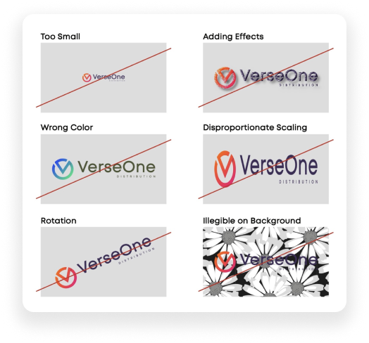
Do's and Dont's
It’s important that the appearance of the logo remains consistent. The logo should not be misinterpreted, modified, or added to. Its orientation, color, and composition should remain as indicated in this document — there are no exceptions.
DO’S
- SPACE AROUND THE LOGO; Logo should always be given some breathing room. Preferably placement is on white or neutral backgrounds.
- PLACEMENT ON DARK BACKGROUNDS; If the logo needs to be placed on a dark background, use the negative logo.
DONT’S
- DO NOT sit the logo on high contrast or vibrant colors. Do not place the logo on colors and tones similar to the logos colors
- DO NOT tilt, rotate, stretch, skew or distort the logo in anyway.
- DO NOT add unnecessary embellishments like drop shadows, gradients, embossing etc. to the logo